In this article we will be looking at how you can use Excel to keep track of your account’s performance. This is meant as a basic guide for people who have little or no experience with Excel.
Using Excel To Track Your Stock Portfolio – Getting Some Data
Before we can do anything with Excel, we need to get some numbers! The information you use in excel is called “Data”. Some of it we will need to write down, some can be copied and pasted, and some we can download directly as an excel file.
Getting Your Historical Portfolio Values (Typing Numbers In The Spreadsheet)
You can find your Historical Portfolio Values on your Dashboard page, right above your portfolio value chart:

This will download a spreadsheet with your portfolio values, number of trades, and your rank for each day you were in your current contest.
Getting Historical Prices For Stocks (Copy And Pasting Data In To A Spreadsheet)
For this example, we want to get the historical prices for a stock so we can look at how the price has been moving over time. First, a new blank spreadsheet in Excel.
We will use Sprint stock (symbol: S). Go to the quotes page and search for S:

Next, click the “Historical” tab at the top right of the quote:

Next, change the “Start” and “End” dates to the time you want to look at. For this example, we will use the same dates that we saved for our portfolio values, January 11 through January 15, 2016.
Once you load the historical prices, highlight everything from “Date” to the last number under “Adj. Close” (it should look like this):

Now copy the data, select cell A1 in your blank excel spreadsheet, and paste.

Congratulations, we have now imported some data into excel! Notice that your column headings are already detected – this will be important later.
From there, there are few things we would like to change.
Changing The Order Of Your Data
First, this data is in the opposite order as our portfolio values. To get it in the same order, we want to sort this table by date, from oldest to newest. At the top menu, click on “Data“, then click “Sort“:
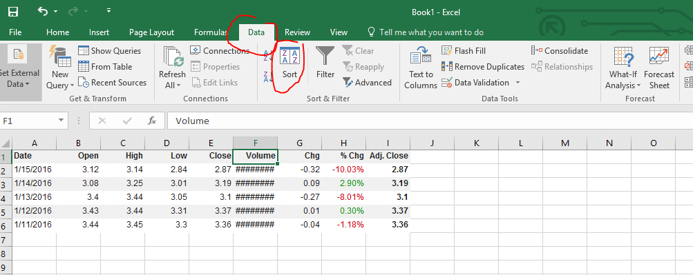
You can now choose what we want to sort by, and how to sort it. If you click the drop-down menu under “Sort By”, excel lists all the column headings it detects (select “Date“). Next, under “Order”, we want “Oldest to Newest“:

Now your data should be in the same order as your portfolio values from earlier.
Changing Column Width
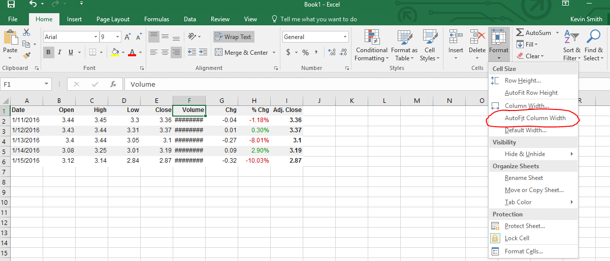
Next, you’ll notice that “Volume” appears just as “########”. This is not because there is an error, the number is just too big to fit in the width of our cell. To fix this, we can increase and decrease the widths of our cells by dragging the boundaries between the rows and columns:

Tip: if you double click these borders, the cell to the left will automatically adjust its width to fit the data in it.
If you want to automatically adjust all your cells at once, at the top menu click “Format”, and “Auto Fit Column Width”:
Once you’ve adjusted your volume column, everything should be visible!
Removing Columns You Don’t Need
I think that we will only want to use the Adj. Close price in the calculations we will be doing later (the “Adj. Close” price is the closing price adjusted for any splits or dividends that happened since that day). This means I want to keep the “Date” and “Adj. Close” columns, but delete the rest.
If you try to just select the data and delete it, you’ll end up with a big empty space:
![]()
Instead, click on “B” and drag all the way to “H” to select the full columns:
![]()
Now right-click and click “Delete”, and the entire rows will disappear. Now the Adj. Close will be your new column B, with no more empty space. You now have your historical price data, so save this excel file so we can come back to it later.
Getting Your Transaction History And Open Positions
Like your historical portfolio value, we make this easy – next to your Open Positions and your Transaction History, you will find more Excel export buttons:

Regardless of the date range showing on the transaction history page, the export will pull your entire transaction history for this contest.
Using Excel To Track Your Stock Portfolio – Graphing
Now that we have some data, let’s make some graphs with it! We will go over how to make line graphs of your daily portfolio value and your portfolio percentage change, plus a bar chart showing your open positions. This is usually the most fun part of using excel to track your stock portfolio.
Line Graph – Your Daily Portfolio Value
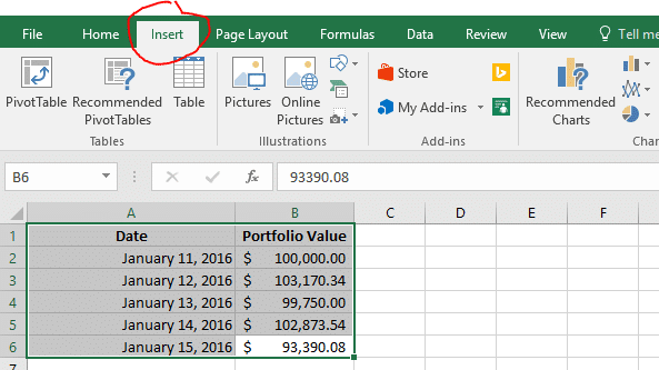
First, we want to make a line graph showing our daily portfolio value. First, open your spreadsheet that has your daily portfolio values:

Next, highlight your data, and click “Insert” on the top tab:
Here, under the “Charts” section, click on the one with lines, and choose the first “2d Line Chart“:

And that is it! Your new chart is ready for display. You can even copy the chart and paste it in to Microsoft Word to make it part of a document, or paste it into an image editor to save it as an image.

Line Graph – Portfolio Percentage Changes
Next, we want to make a graph showing how much our portfolio has changed every day. To do this, first we need to actually calculate it.
Doing calculations in Excel
In the next column we will calculate our daily portfolio percentage change. First, in the next column, add the header “% Change”

Now we need to make our calculation. To calculate the percentage change each day, we want to take the difference between the most recent day’s value minus the day before, then divide that by the value of the day before:
Percentage Change = (Day 2’s Value – Day 1’s Value) / Day 1’s Value
To do this, in cell C3 we can do some operations to make the calculation for percentage change. To enter a formula, start by typing “=”. You can use the same symbols you use when writing on paper to write your formulas, but instead of writing each number, you can just select the cells.
To calculate the percentage change we saw between day 1 and day 2, use the formula above in the C3 cell. It should look like this:

Now click on the bottom right corner of that cell and drag it to your last row with data, Excel will automatically copy the formula for each cell:

You now have your percentages! If you want them to display as percentages instead of whole numbers, click on “C” to select the entire column, then click the small percentage sign in the tools at the top of the page:

Making Your Graph With Only Certain Columns
Now we want to make a graph showing how our portfolio was changing each day, but if we try to do the same thing as before (selecting all the data and inserting a “Line Chart”, the graph doesn’t tell us very much:

This is because it is trying to show both the total portfolio value and the percentage change at the same time, but they are on a completely different scale!
To correct this, we need to change what data is showing. Right click on your graph and click “Select Data”:

This is how we decide what data is showing in the graph. Items on the left side will make our lines, items on the right will make up the items that appear on the X axis (in this case, our Dates).
Uncheck “Portfolio Value”, then click OK to update your graph:

This is closer, but now we want to move the dates back to the bottom of the graph (here they are along the “0” point of the Y axis).
To do this, right-click on the dates and select “Format Axis”:

A new menu will appear on the right side of the screen. Here, click “Labels”, then set the Label Position to “Low”.

Congratulations, your graph is now finished! You can now easily see which days your portfolio was doing great, and which days you made your losses.
Bar Chart – Seeing Your Open Positions
Next we would like to make a bar chart showing how much of our current open positions is in each stock, ETF, or Mutual Fund.
First, open your spreadsheet with your Open Positions. It should look something like this:

Since we want to make a bar chart, we can only have two columns of data. We want one column showing the symbol, and a second column showing how much it is worth. The “Total Cost” column is the current market value of these stocks, so that is the one we want to keep. However, we don’t want to delete the quantity and price, since we might want it later. Instead, select the columns you don’t want, and right-click their letter (A and C in this case). Then, select “Hide”:

Now the columns that we don’t want in our chart are hidden. We can always get them back later by going to “Format” -> “Visiblity” -> “Unhide Columns”. Now select your data and insert a “Bar Chart” instead of a “Line Chart”:
Before you’re finished, your chart will say “Total Cost”. You can change this by clicking on “Total Cost” and editing to say whatever you would like (like “Portfolio Allocation”):

This graph is now finished, but you can also try changing the Chart Type to try to get a Pie Chart. First, right click your graph and select “Change Chart Type”:

Next, find the “Pie” charts, and pick whichever chart you like the best.
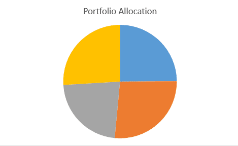
Last, now we don’t know which piece of the pie represents which stock. To add this information, click your pie chart, then at the top of the page click “Design”. Then select any of the options to change how your pie chart looks.

Congratulations, you’ve converted your bar chart into a pie chart! This one should look almost the same as the one you have on the right side of your Open Positions page.
Using Excel To Track Your Stock Portfolio – Calculating The Profit And Loss Of Your Trades
The most important reason you would want to use excel to track your stock portfolio is trying to calculate your profit and loss from each trade. To do this, open the spreadsheet with your transaction history. It should look something like this:

Tip: If you have not bought and then sold a stock, you can’t calculate how much profit you’ve made on the trade.
First, we want to change how the data is sorted so we can group all the trades of the same symbol together. Use the “Sort” tool to sort first by “Ticker”, next by “Date” (oldest to newest).
![]()
For DWTI and SPY, we haven’t ever “closed” our positions (selling a stock you bought, or covering a stock you short), so we cannot calculate a profit or loss. For now, hide those rows.
![]()
Now we’re ready to calculate! Lets start with the trade for S. This one is easy because the shares I sold equal the shares I bought. This means if we just add the “Total Amount”, it will tell us the exact profit or loss we made on the trade.
![]()
This does not work for UWTI, because I sold a different number of shares than I bought. This means that I need to first calculate the total cost of the shares I sold, then I can use that to determine my profit.
First: multiply your purchase price times the number of shares you sold:
![]()
Second: add this number to the “Total Amount” from when you sold your shares.
![]()
Now you have your profit or loss for this trade. Note: this is the method for if you bought more shares than you sold – if you bought shares at different prices, then sell them later, you’ll need to calculate your Average Cost to use in your calculation.
Pop Quiz
[qsm quiz=52]
 Teacher Introduction Webinars
 Starting A Business
 Factors that Impact Stock Prices
 Protecting Against Fraud Presentation