
Definition
“Major Economic Indicators” are numbers that you can look at to try to get a picture of how well the economy is doing. Different indicators measure different parts of the economy, but their main characteristic is that they measure the same thing in the same way over time. This means that you can compare the indicators from one month, quarter, or year to each other to see if the statistic you’re interested in as improved for declined over time.
Major Economic Indicators Measuring Output
Gross Domestic Product – GDP

US GDP from 1947 – 2015 (Source: St. Louis Federal Reserve Bank)
Gross Domestic Product, or GDP, is the measure of how many finished goods and services were produced in a country over the course of a year. This is the biggest estimator of how the economy as a whole is doing – the total value of everything that was produced, ready for consumption.
The fact that it only measures finished products is important – this means that goods that are produced to be added to a different product later are not counted. An example of this is raw steel that is later used to build a car is not counted as part of GDP, but the car itself is.
Purchase Power Parity – PPP
If you want to compare the GDP between countries, just taking the GDP from each country and multiplying by the exchange rate will not give the full picture. In Russia right now, a Big Mac costs 114 Rubles, which is only $1.53, or about 1/3 the US price ($4). To get a true measure of GDP, we want to measure the value of production “Apples to Apples”, meaning a Big Mac produced in the United States should be counting as the same value as a Big Mac produced in Russia. The Purchase Power Parity measure of GDP tries to do this, and the Big Mac Index used by the Economist is a simple example.
GDP measured with PPP says that the Big Mac produced in the USA and Russia are both worth the same amount ($4 US Dollars).
Per Capita GDP
Even when we take the GDP at PPP, we still are not really comparing how much “stronger” one economy is compared to others. An example of this is comparing the United States to China – the United States had $16,770,000,000 in GDP in 2013, while China had a GDP (PPP) of $9,240,000,000. However, this does not mean that American workers were producing 1.8 times that of Chinese workers, since this does not account for population.
Per Capita GDP is just that – dividing the GDP at PPP by a country’s population. The Per Capita GDP of the United States in 2013 was $53,041.89, while the Per Capita GDP (PPP) of China was $6,807.43 – meaning for each person in the country, the United States was producing 7.79 times as much!
Gross Output – GO

Gross Output – GO – 2005 – 2015
Gross Output is a new measure – just started to be taken in 2005 in the United States, that instead measures the total industrial output, including the “middle stages” of production (the raw steel and the car are both counted).
Gross Output is an important secondary measure, like the other side of GDP. One way to think about it is that GO measures the “Make” economy, while GDP measures the “Use” economy – you should look at both to get a complete picture.
This major economic indicator is fairly new, which means it is not accurately measured in most other countries yet, so it is less common to see PPP or Per Capita numbers of Gross Output.
Major Economic Indicators Measuring Prices
Inflation is the process where money is worth “less” over time. With the same Big Mac example, the sandwich costs $4 today, but was $2.32 in 1995. When we want to compare GDP, incomes, or prices across time periods, we need to control for the differences in prices and inflation.
Consumer Price Index (CPI)
The Consumer Price Index, or CPI, is the most common measurement of inflation in the United States. CPI tries to measure how much prices for the same goods is changing over time. This is done by using a “market basket” of goods – a long list of things that researchers go out and find the prices for every year, and then take the average change. For example, the cost of bread might go up by $0.05, but the cost of a flat screen TV goes down by $50. CPI researchers use a complex system to balance out price changes by how much of each item a “typical household” buys in a year, and the result is what is considered the inflation rate.
This works well when comparing prices from one year to the next, but some problems come up when comparing years that are far apart, because the “market basket” might not be changing even though what people are actually buying does. To fix this, researchers ask 14,000 families every 10 years to keep detailed records of everything they buy for 3 months. It then uses these purchases as the basis for a new “market basket”.
Producer Price Index (PPI)
The Producer Price Index, or PPI, is the other side to CPI, how the prices are changing for producers. Like CPI, PPI measures a “basket” of goods used in production. These measures are things like coal and scrap iron, as well as other intermediate goods. For example, the cost that a tire company charges a car manufacturer for a bulk order of tires could be part of the Producer Price Index.
Since the “intermediate” goods are all wholesale, or from one manufacturer to another, the PPI used to be called the “Wholesale Index”. The PPI also has a problem with its measurement – because the economy is constantly evolving, the intermediate goods that are part of the measurement are also always changing, but these changes might not be reflected in the PPI measurement.
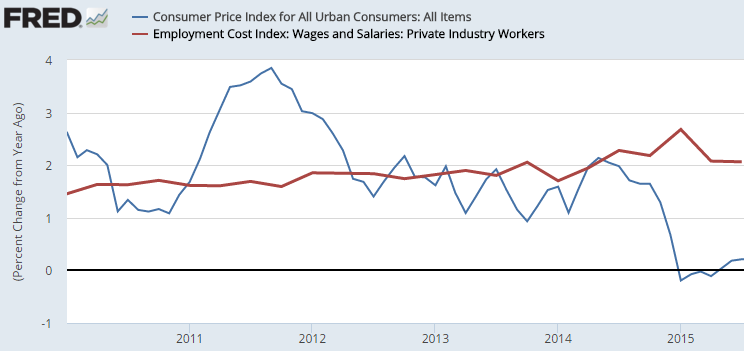
Employment Cost Index (ECI)
The ECI tries to measure how much the cost of labor moves over time. This measures the pay for all employees in the United States, along with other compensation costs (like health insurance and pension plans). Measuring how the ECI moves compared to the CPI can give some indication if workers are getting “richer” or “poorer”.
Major Economic Indicators Measuring Labor
Measuring jobs is important – everyone’s eyes are always on the unemployment rates and how many jobs are created every year. However, it is important to remember what exactly these rates are so you know how to interpret them.
Unemployment Rate
The unemployment rate measures the total percentage of the active workforce that currently doesn’t have a job. This might sound simple, but it can be fairly complicated.
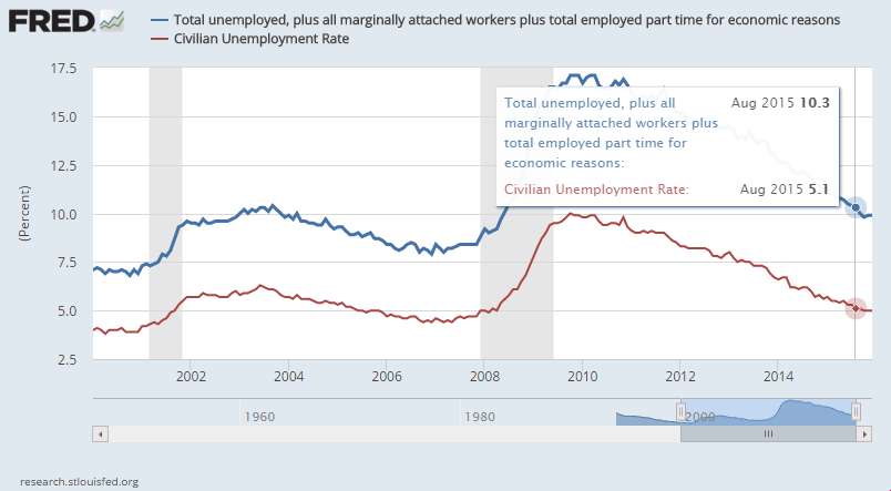
For example, the “Active Workforce” is anyone between the ages of 16 and 65 who is either working and is actively looking for a job, which is measured by a survey asking people how many hours they looked for a job in the last week. This means if someone does not have a job, but was visiting family last week, they are not counted as “unemployed”. This also means that workers who have temporarily given up looking for a job because they have been looking for so long without any luck are also not counted as “unemployed (these people are called “discouraged workers”). Anyone over 65 who still is looking for a job is also not counted. These last three groups together are called “marginally attached”.
Another important factor is that if you have a job, but you’re looking for a new one, you are not counted either. This means that if you can find a part-time job working for 3 hours a week, you are not counted as unemployed (you are counted as “working part time for economic reasons”). When you add “marginally attached” and “working part time for economic reasons”, the group of people looking for a job can double:
Payroll Employment
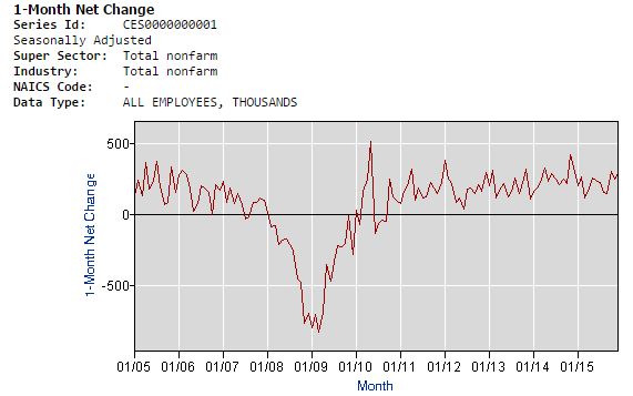 Payroll Employment measures how many people are working on salary, plus how the average amount of hours the average hourly employee is working. The movement in payroll employment tells us how many jobs have been created. This is important because when the economy starts to improve, many “marginally attached” workers will re-join the “active workforce”, which means the unemployment rate can go up even if more jobs are being created. Looking at payroll employment, and comparing it with the unemployment rate, can give a much stronger picture of how the labor market is moving.
Productivity
 “Productivity” is a major economic indicator that measures how much each worker is producing. As workers produce more, they become more valuable. However, when a company suddenly lays off many workers, this can also increase productivity. The reason is that the remaining workers might be working harder because they are afraid to lose their jobs, or because the people who are laid off are usually the least productive (the employees that companies can “afford to lose” the most).
This means that a spike in productivity during a recession is probably a bad sign (the graph on the right show a huge boost in 2009 and 2010, when workers were being laid off in the recession), but a spike in productivity during an expansion is a sign that the economy is growing strongly.
Getting Data On Major Economic Indicators
These are the best places to get data on these indicators:
St. Louis Federal Reserve Bank Economic Research Center (http://research.stlouisfed.org) – Interactive graphs for thousands of data series, you can build your own charts from nearly any set of economic data you want! All data series is also exportable to excel.
US Department of Commerce Bureau of Economic Analysis (BEA) (http://www.bea.gov) – The research organization that builds GDP and production data for the United States, some interactive tables but most data is for export to excel.
Department of Labor Bureau of Labor Statistics (BLS) (http://www.bls.gov) – Research organization that gathers price and employment data for the United States, many quick tables and data you can export to excel.
World Bank Open Data (http://data.worldbank.org) – Excellent resource for getting major economic indicators from nearly every country around the world. This has less diverse data for the US than the other two sources, but is great for general indicators.
The Economist’s Big Mac Index (http://www.economist.com/content/big-mac-index) – This is a great tool to get a rough estimation on Purchase Power Parity across hundreds of countries around the world, and shows currency exchange rates in comparison, with an interactive map.
Pop Quiz
[qsm quiz=67]